
Buttons
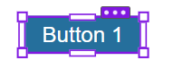
To include a button in the communication, drag and drop the button symbol from the right to the place in the communication where you want the button to appear. The button appears in the communication as follows:
You can resize the button by dragging the corners. Click the three dots to see a menu that allows you to delete or copy the button, as well as to bring it into the foreground or send to the background.
Editing the button
Once you have inserted the button, click it. The block palette for editing appears at the right:
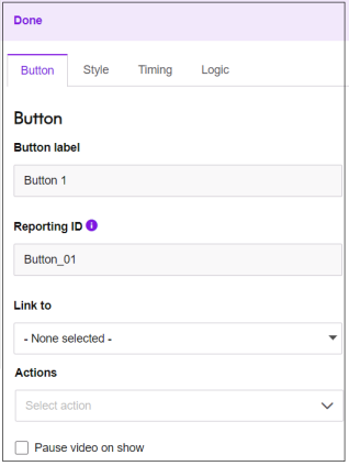
The available fields are described below:
- Button label. The text that appears on the button.
- Reporting ID. This is used to identify button clicks in the CSV file that you can download when looking at Video Reporting Statistics. Communicate will allocate a Reporting ID when you add a new button, but you can edit this ID.
The Reporting ID should be unique within each video. If multiple buttons have the same ID, only the last button clicked is shown in the report. There may be occasions when this is what you want. For example, if you have an ID called rating, you could allocate the same ID to five buttons labelled 1, 2, 3, 4 and 5. The report will then show (in the column for rating) which value was last clicked.
If you edit a video that was created with a button before the Reporting ID functionality was introduced, the ID will be blank and you need to add a value if you want the button clicks to be included in the CSV report file. - Link to. This dropdown defines what happens when the
user clicks the button. The following options are available:
Link to url: The URL specified under Link URL is opened when the user clicks the button.
This link can also be one of the following: a mailto: link (to send an email); a tel: link (to make a telephone call); or an sms: link (to send an SMS message).
- Link to scene: The video goes to the specified scene when the user clicks the button.
- Link URL. If Link to is set to Link to url, this field specifies the URL.
Click the Add personalization button at the right (
 ) to insert a variable at the cursor position in the Link URL field. For more information, see Personalizing communications. With variables inserted, the field looks like this:
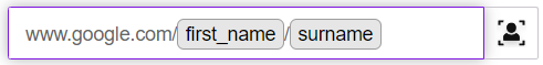
An alternative way of including a variable is to enclose the variable name in double curly brackets. For example:
www.{{domain}}.com
{{domain}} will be replaced with the value of the variable called domain in your selected Data Source (selected using the Contacts tab).
You can include the uid of the current Data Source row in the URL. To do this, simply enter "uid" in double curly brackets like this: {{uid}}.
Note:When the channel does not have a data source connected, or if the user did not add it in an API call, it will resolve to an empty value.You can also link a button to a text box or dropdown value from elsewhere in your video. To do this, enter the ID in the Link URL field. For example, if the text box ID is overlay_123, enter the following in the Link URL field:
{{overlay_123}}
This will be replaced with the value entered from the text box with that ID.
Note:The button with the link should be placed after the scene that contains the linked text box or dropdown; if it is in the same scene or later, the default will be used if defined (or empty if not defined). - Actions. You can select an action to be added to the video. For how to create actions, see Configuration.
- Pause video on show. Select this box if you want the video to be paused when the button appears. Note that the video will only be paused when the button entrance animation is complete, the button is fully visible and all the transition-in is done. The video will only resume when the user interacts with it by clicking the Button or Submit Button.
Click the Style tab to edit style properties for the button. The following screen is displayed:
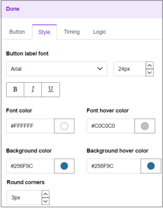
The available fields are described below:
- Button label font. The font and font size to be used for the button label text. You can also select bold, italic or underline.
- Font color. The color of the font of the button label text. You can specify a hex value or choose from the pallet.
- Font hover color. The color of the button label text when the user hovers over the button. You can specify a hex value or choose from the pallet.
- Background color. The background color of the button. When you click the color picker, a pipette symbol is displayed (
 ). Click this to select a color from anywhere within the screen, instead of just from the palette.
 - Background hover color. The background color of the button when the user hovers over it. When you click the color picker, a pipette symbol is displayed (). Click this to select a color from anywhere within the screen, instead of just from the palette.
- Round corners. This lets you create a button with round corners by specifying the radius.
For information about how to use the Timing tab, see Timing tab.
For more information about how to use the Logic tab, see Using the Logic tab to apply conditions.