Card display type for messages
Note:
For a Message interaction, go to the Buttons tab and select Card as the display type.
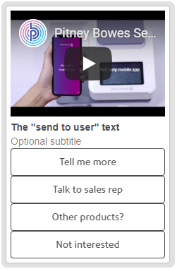
Define a card for a message interaction that can contain up to 10 buttons (Postback, URL, Account Link or Phone), a single image, a title (the name of the card) and a subtitle. The image and subtitle are optional. For example:

| Subtitle | Text that displays below the Send to user message and above the buttons. Optional. |
| Image URL | Optional. URL of the image or video to display on the card. You can use a global variable for all or part of the URL path. If the link has metadata, the user sees a preview in the chat window so that, for example, clicking the preview plays the video in the chat window. Notes:
|
| Display | Click |
